Understanding Tick chart
-
- 0
- 6797
- 0
What is a tick chart?
Unlike a traditional candlestick/candle chart, tick charts are not a function of time. They enable you to enrich your technical analysis with different information:
1 - Simplified analysis
2 - Time-independent view
3 - Confirmation of trend line breaks
4 - Detection of output signals
5 - Correlation between volume and price evolution
Let's take an example to better understand this:
- on a traditional 1 hour chart, a candle corresponds to the price changes (opening, high/low, closing) over the current hour. This candle will close as soon as the time is over; i.e. at 10am sharp, the 9am candle closes, and the 10am candle opens.
- on a 100 tick chart, one candle corresponds to 100 ticks. But you still need to know what a tick is.
A tick represents a transaction between a buyer and a seller. Each transaction is characterized by a number of shares traded at a certain price level. On a 100 tick chart, each candlestick corresponds to the price evolution on 100 consecutive ticks (or 100 consecutive transactions/exchanges).
It is then clear that tick charts are not linear over time; 100 ticks can be performed in 5 minutes, 1 hour or 1 day, depending on the volatility of the stock in question.
1 - Simplified analysis of a tick chart
When the market is "active", a traditional view does not show micro trends. Indeed, sudden increases or decreases are often only represented by a long green or red candlestick even when you opt for a 1 minute view.
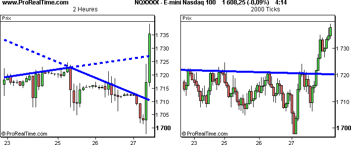
The chart above left, with the 2 hour view, alternately displays several long candlesticks (usually during the day) and several short candlesticks (usually at night). A first line of bullish resistance can be plotted. As you can see, this traditional 2 hour view does not enable the maximum streak reached during the day to be identified. Therefore, we might have thought that the price could continue to rise until this first bullish resistance. A second resistance line, this time bearish, can be plotted, but belatedly. These two resistances are in fact minor.
In the (x) ticks view, the long candlesticks are divided into small candlesticks with 2,000 ticks each. A major resistance line can be plotted, which makes it easier to anticipate the trend throughout this period.
2 - Time-independent view on tick charts
When the market is 'quiet' with little buying and selling activity, the traditional 2 hour view displays flat candlesticks that do not provide much information, as shown in the chart above.
The 2,000 ticks view shows only a few candlesticks for quiet periods (since there are only a few transactions) and avoids the accumulation of unusable candlesticks. This simplifies trend detection. Your decisions will be more reasoned.
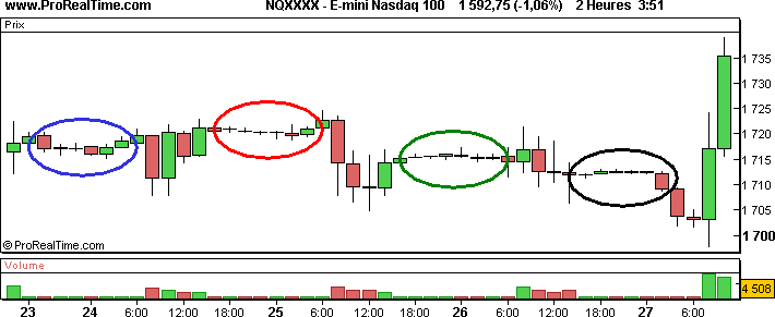
In the image below, we have coloured the even days white and the odd days yellow.

In the time based view, each day has the same number of candlesticks.
This is not the case in the (x) ticks view, which displays more candlesticks for high activity days and fewer candlesticks for low activity days. For example, on 27th April, the ticks view displays 32 candlesticks while it only displays 16 candlesticks for 26th April. By studying this chart, you compare candlesticks that are equally important in relation to each other, from one day to the next.
3 - Confirmation of trend line breaks on tick charts
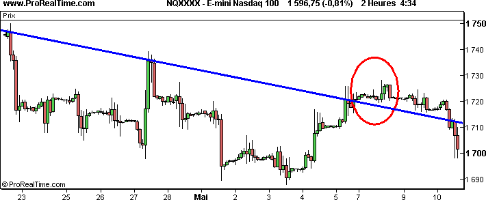
The image above shows a 2 hour view chart and a 3,000 ticks view chart. Both have almost the same number of candlesticks. Looking at the 2 hour chart, the major resistance line breaks on 5th May. Many investors had probably positioned themselves for purchase thinking that this was the start of a bullish trend.
In the (x) ticks view, the trend line holds. If you had both views, you would certainly wait for the bullish break in both views before making the decision to enter the market. So you wouldn't be buying!
Your decision is therefore much better if you also benefit from the (x) ticks view!
4 - Detection of exit signals on tick charts
Imagine that you wanted to trade Euro Bund futures in real time, with the information available on 25th April at 10am (see chart below).
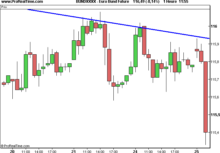
We think that the trend will be bearish in the very short term, so we sell at 10:16 am at a price of 115.55.
The 1 hour chart makes it difficult to predict the short term asset price movements. The only thing we know for sure is that we have, so far, done well to sell.
Let's opt for a 1 minute view and a 100 ticks view as shown in the following image. Note that this is the same time period with a maximum of about 115.9 and a minimum of 115.33.
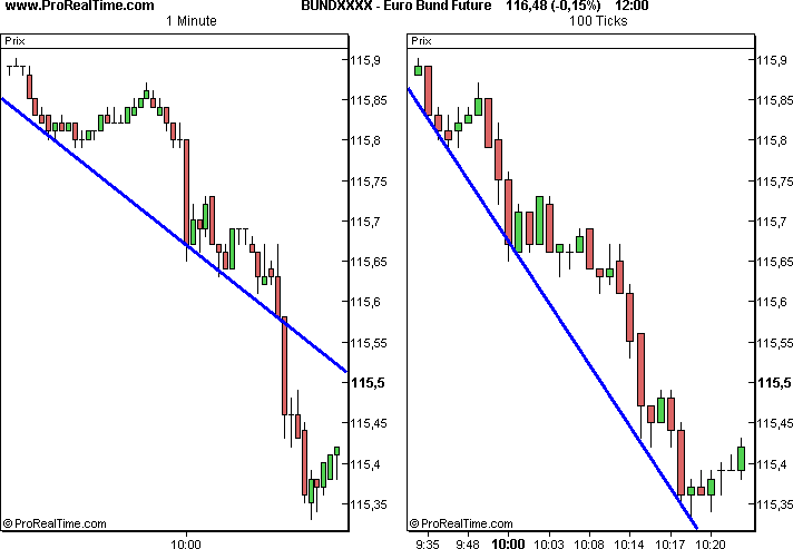
Euro Bund futures drop sharply at around 10am. This drop, depicted by a long candlestick in the 1 minute view, is represented by several small candlesticks in the (x) ticks view: so you can plot very short term support different from that envisaged in the 1 minute view.
The 1 minute view chart again displays a long candlestick at 10:15 am that breaks the support line. We sell the asset and the market proves us right.
After a few minutes, investors who only looked at the 1 minute view is faced with a choice: hope that the value will continue to fall without any indication on the duration of this future decline or exit the market and wait for new opportunities.
Unfortunately for these traders, their choice is based solely on emotions. Imagine, for example, the disappointment because of a precipitous exit from the market, which is justified by making gains that balanced off the previous day's losses, while the market continues to decline. Or imagine, on the contrary, the disappointment because of a maintained short position while the market gradually recovers all its unrealised capital gains.
As you can imagine, the chances of feeling disappointed at the end of the day are quite high!
At the same time, the lucky investor who benefits from both views can decide based on the results obtained by observing the charts. For example, at 10:25 am, he could decide to buy back 50% of his short position because the price just hit the very short term support line. This investor exits his position at the right time and so increases his profits.
5 - Correlation between volume and price movements
Another major advantage of an (x) ticks view is the display of easily usable volume bars.
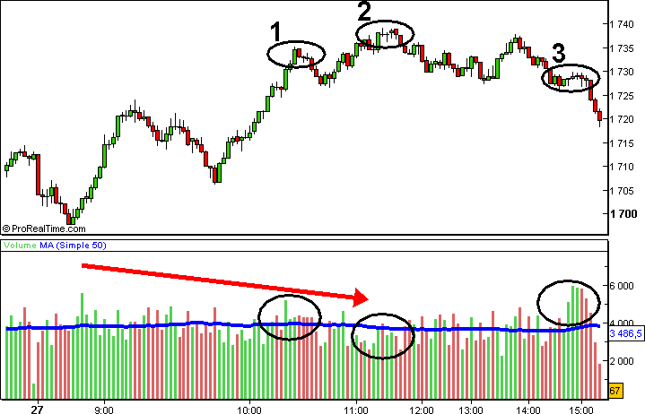
In the traditional time based view, volume only indicates the number of securities traded during the time period considered.
No indication is given regarding the type of investors that are buying (i.e. institutional or private investors).
In the (x) ticks view, each volume bar is the sum of the transaction volumes that make up the associated candlestick. Since the number of transactions per candlestick is constant, each volume bar actually reflects the average volume of transactions that make up the associated candlestick. Let's study a concrete example:
Using a 5 ticks view, here is how to calculate the value of the volume bar on a fictitious asset example:

The volume bar of the associated candlestick would in this case be:
1,210 + 840 + 310 + 243 + 670 = 3,273
By displaying a moving average of your volume bars (identified in blue in the example above), when your volume bar is higher than the value of this moving average, you can consider that the transactions that make up this bar are the result of the activity of "large investors" compared to the average on this asset. These "large investors" are certainly more informed than the "small investors". In a bullish trend, this is often a signal of bullish continuation.
Experience shows that when a new, higher level is reached (see zone 2 in the example above) with shorter volume bars than those visible at the previous highest level, the continuation of the increase is often compromised.
The high volume bars in zone 3 reveal that some major investors are buyers and others are sellers. This indecision causes a temporary price stagnation. Then, when the very short term support line is broken, 'small sellers' lower the value.
Conclusion
We have presented the advantages of the (x) ticks view by comparing it to the traditional time based view.
(X) Tick view charts are often different from time based charts with views for a given value and an identical display period. This additional information can help you make the right decisions to enter or exit the market. In most cases, (x) tick charts are easier to use.
Source: https://www.prorealtime.com/en/partner_redirect.phtml?pr_from=centralcharts&pr_page=x-tick-charts