Understanding Kagi chart
- 1960
- 0
- 0
What is a Kagi chart?
A Kagi chart is a graphical representation of prices from the Middle East.
A Kagi chart is not a function of time but only of prices.
The colour and direction of the Kagi lines are linked to the market trend. They enable traders to determine the current trend easily and quickly, as well as trend reversals.
Variation units in a Kagi chart
Like a Renko chart a Kagi chart is a function of usage variations determined by the trader. The variation unit can be set as a point or a percentage.
A new bar is added to the Kagi chart as soon as the price increases or decreases by the chosen variation unit.
Example: if the variation unit is set to 1%. As soon as the price rises by 1%, a bar is added to the Kagi chart. As soon as the price drops by 1%, a bar is added to the Kagi chart.
The direction and colour of the bar are a function of the movement’s direction and the previous highest/lowest points.
The variation unit for a Kagi chart can be applied at different prices
- Closing
- Opening
- Highest
- Lowest
- Typical: (High + Low + Closing) / 3
- Weighted: (High + Low + 2 times closing) / 4
- Median: (High + Low) / 2
- Total: (Opening + Highest + Lowest + Closing) / 4
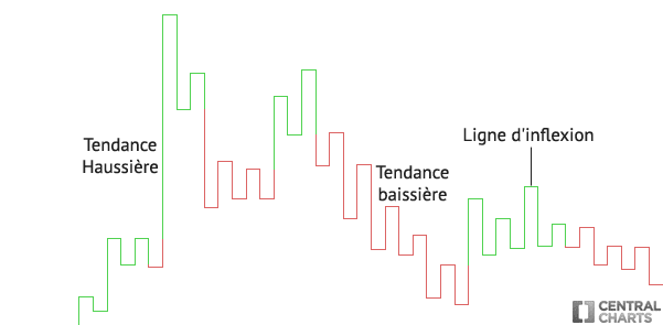
Construction of a Kagi chart
- If the price moves in the same direction, the Kagi chart remains the same colour and is extended.
- If the price turns by one variation unit but the price has not broken a highest/lowest point observed in the past, a new line is added to the Kagi chart in the opposite direction. This is called a reversal threshold.
- If the price breaks a highest or lowest point observed in the past, the Kagi chart’s line changes colour.
NB: horizontal lines on a Kagi chart do not really exist. These lines are added automatically to provide continuity to the price. These Kagi chart lines are also called "inflection lines".
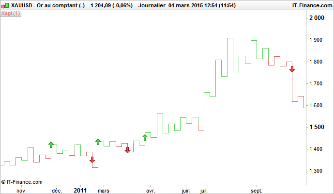
How do you use a Kagi chart? What signals does a Kagi chart give?
1st method:
A trader can buy when the Kagi chart line turns green (bullish trend) and sell when the Kagi chart line turns red (bearish trend)
Here is what it looks like graphically:
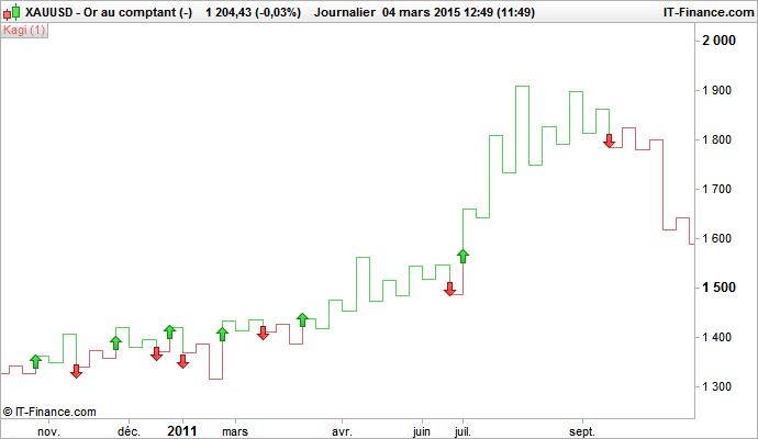
2nd method:
A trader can buy when a Kagi chart line breaks one or more previous points higher than the Kagi chart line; and sell when the Kagi chart line breaks one or more previous points lower than the Kagi chart line.
Here is what it looks like graphically (with expectation of breakage from two previous highest/lowest Kagi points):